

Description
Introduction
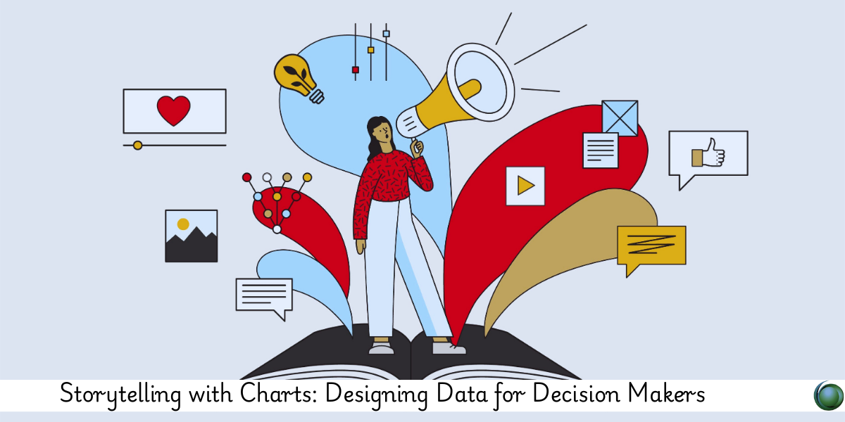
Data, in its raw form, often fails to inspire action. But when crafted into clear, purposeful charts, it becomes a compelling narrative that drives decisions. This course teaches how to design charts not just for beauty or clarity, but with the intent to influence strategic thinking. It’s about shaping insights into stories that executives, stakeholders, and teams can act on.
Prerequisites
-
Basic understanding of data visualization
-
Familiarity with tools like Excel, Tableau, or Power BI
-
Exposure to analytics or decision-making contexts
Table of Contents
1. The Role of Charts in Data Storytelling
1.1 Why Charts Are More Than Just Visuals
1.2 Data Literacy and Decision-Making
1.3 Chart Types as Narrative Devices
1.4 Moving from Data Dump to Data Dialogue
2. Understanding Your Audience
2.1 Decision-Maker Profiles and Information Needs
2.2 Cognitive Load and Simplification
2.3 Tailoring Insights to Context
2.4 Presenting Uncertainty with Confidence
3. Chart Design Fundamentals
3.1 Chart Selection Based on Message
3.2 Axis, Labels, and Legends Best Practices
3.3 Avoiding Misleading Visuals
3.4 Emphasis, Contrast, and Hierarchy in Design
4. Designing for Business Impact
4.1 Charts That Highlight Change and Trend
4.2 Comparative and Diagnostic Visuals
4.3 Visualizing KPIs, ROI, and Business Metrics
4.4 Leading Viewers to Conclusions
5. Narrative Techniques in Charting
5.1 Sequencing Insights for Flow
5.2 Using Annotations and Headlines Effectively
5.3 Storyboarding with Multiple Visuals
5.4 Integrating Data with Verbal and Written Narratives
6. Tools and Templates
6.1 Designing in Tableau, Power BI, and Excel
6.2 Advanced Charting with Flourish, Datawrapper, and D3.js
6.3 Slide Deck vs. Dashboard Design Principles
6.4 Template Libraries for Reuse and Speed
7. Real-World Applications
7.1 Executive Dashboards That Tell a Story
7.2 Pitch Deck Visuals for Product Strategy
7.3 Operational Reporting for Daily Decisions
7.4 Visuals for Investor and Board Meetings
8. Common Pitfalls and How to Avoid Them
8.1 Data Overload and Visual Clutter
8.2 Misalignment Between Chart and Message
8.3 Misuse of Color and Scale
8.4 Ignoring Audience Context
9. Practice and Review
9.1 Critiquing Real Charts for Effectiveness
9.2 Redesigning Flat Visuals into Stories
9.3 Building a Portfolio of Impactful Charts
9.4 Presenting Visuals with Confidence
Designing charts for decision makers is about clarity, persuasion, and purpose. With the right design mindset and narrative technique, every chart becomes a strategic communication tool. By the end of this course, you’ll be equipped to create data visuals that drive real decisions, not just decorate slides.


Reviews
There are no reviews yet.