

Description
Introduction
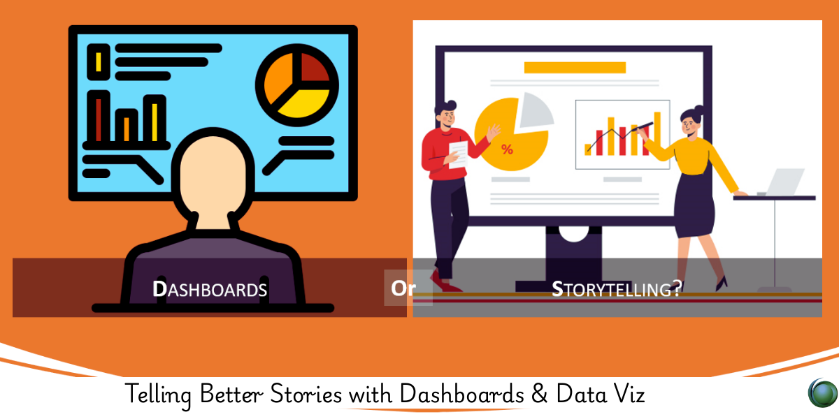
Data dashboards are no longer just a place to dump charts—they’re storytelling tools. This course empowers professionals to design dashboards that don’t just inform but influence. Learn how to apply principles of narrative thinking, cognitive design, and business storytelling to dashboards, making them intuitive, engaging, and impactful.
Prerequisites
-
Basic knowledge of data analysis (Excel, SQL, or BI tools)
-
Familiarity with dashboard platforms like Tableau, Power BI, or Google Data Studio
-
Awareness of business KPIs and decision-making processes
-
No prior experience in storytelling required
Table of Contents
1. The Purpose of Data Dashboards
1.1 From Reporting to Storytelling
1.2 Types of Dashboards: Operational, Analytical, Strategic
1.3 Understanding Stakeholder Needs
1.4 Common Dashboard Pitfalls
2. Core Principles of Data Storytelling
2.1 What Makes a Good Data Story?
2.2 Structure: Beginning, Middle, End
2.3 Aligning Story with Audience Intent
2.4 Using Context to Create Meaning
3. Visual Communication Best Practices
3.1 Choosing the Right Chart for the Right Message
3.2 Color Theory and Emphasis
3.3 Layout and White Space for Cognitive Ease
3.4 Reducing Noise and Clutter
4. Designing Narrative Dashboards
4.1 Wireframing with Purpose
4.2 Sequencing Data for Flow
4.3 Use of Titles, Annotations, and Captions
4.4 Interactive Elements That Support the Story
5. Personalization and User Journey
5.1 Role-Based Dashboards
5.2 Adaptive Filters and User Controls
5.3 Highlighting What Matters Most
5.4 Building for Exploration vs. Presentation
6. Data-Driven Decision Support
6.1 Framing Metrics for Business Impact
6.2 Alerting and Contextual Clues
6.3 Embedding Actionable Recommendations
6.4 Tying Visuals to Strategic Goals
7. Tools and Technologies
7.1 Building in Tableau and Power BI
7.2 Google Looker Studio and Qlik
7.3 Incorporating Narratives with Canva, Flourish
7.4 Embedding Dashboards in Web Platforms
8. Evaluating and Iterating Your Dashboards
8.1 Usability Testing and Feedback Loops
8.2 Engagement Metrics and Behavior Analytics
8.3 Continuous Improvement Strategies
8.4 Story Refinement Over Time
9. Case Studies and Real-World Examples
9.1 Executive KPI Dashboard with Narrative Layers
9.2 Marketing Campaign Dashboard with Story Filters
9.3 Healthcare Data Monitoring with Emotion-Aware Visuals
9.4 Nonprofit Impact Storytelling Dashboards
A dashboard should do more than show data—it should say something. By combining data visualization with storytelling, you guide users through insight, meaning, and action. This course teaches you to move from dashboards that report, to dashboards that resonate—inspiring decisions, alignment, and understanding across teams.


Reviews
There are no reviews yet.