

Description
Introduction
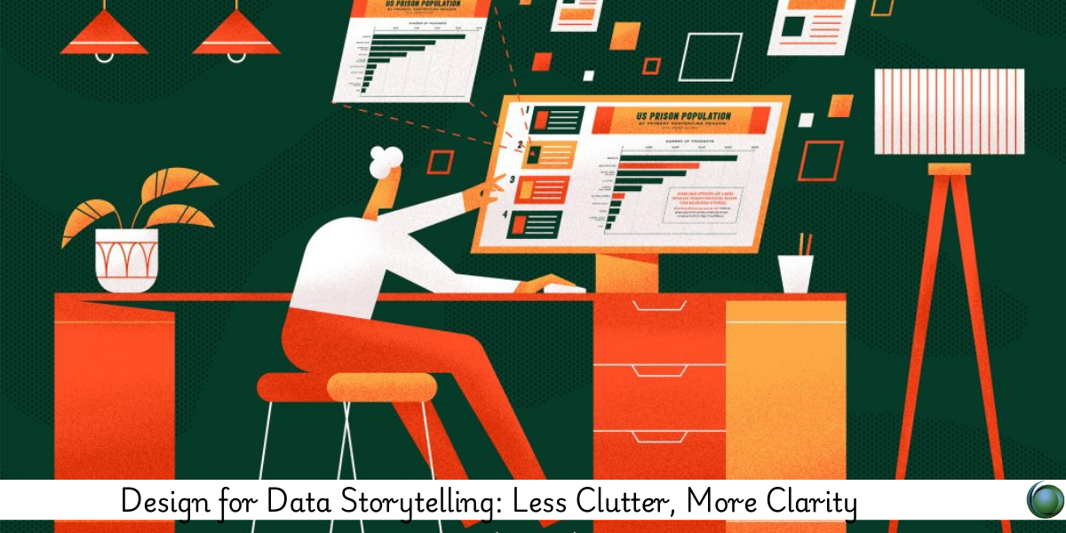
In an age where data is everywhere, the ability to communicate insights clearly and convincingly is more valuable than ever. Data storytelling bridges the gap between raw numbers and human understanding, but without intentional design, even the best insights can get lost in noise. This course is designed to help you declutter your visualizations, sharpen your message, and ensure your audience walks away with the story that matters. Whether you’re building dashboards for executives or creating infographics for the public, this training will help you master the art of simplicity, clarity, and impact.
Prerequisites
-
Basic familiarity with data analytics
-
Experience using at least one visualization tool (e.g., Tableau, Power BI, Excel, or Google Data Studio)
-
A foundational knowledge of different chart types and their use cases
-
Interest in design thinking and data communication
Table of Contents
-
Foundations of Clean Data Design
1.1 What Makes a Great Data Story
1.2 The Psychology Behind Visual Processing
1.3 Avoiding Chartjunk and Unnecessary Elements
1.4 The Data-Ink Ratio Principle
1.5 Minimalism vs. Oversimplification -
Visual Hierarchy and Layout Strategy
2.1 Organizing Information for Rapid Consumption
2.2 Using Alignment and Proximity Effectively
2.3 Creating Focal Points in Your Design
2.4 Balancing Negative Space and Density
2.5 Visual Scanning Patterns and Flow -
Simplifying Without Losing Meaning
3.1 Picking the Right Chart for the Right Message
3.2 Decluttering Labels, Legends, and Axes
3.3 Smart Use of Color, Contrast, and Emphasis
3.4 Typography That Supports the Story
3.5 Communicating Uncertainty with Transparency -
Story-First Design Approach
4.1 Crafting Visual Narratives with Intent
4.2 Adding Meaningful Context with Titles and Annotations
4.3 Highlighting Key Metrics and Patterns
4.4 Structuring Slides and Dashboards for Flow
4.5 Aligning Visuals with Business Objectives -
Tools, Templates, and Workflows
5.1 Designing Clean Visuals in Tableau, Power BI, and Excel
5.2 Using Tools like Figma and Canva for Prototyping
5.3 Leveraging Datawrapper and Flourish for Online Publishing
5.4 Custom Style Guides and Template Use
5.5 Collaboration Between Analysts and Designers -
Case Studies in Redesign
6.1 Financial Dashboard: Before and After
6.2 Healthcare Report: Clarity in Complexity
6.3 Marketing Performance: Aligning KPIs with Visuals
6.4 Survey Feedback: Turning Tables into Insights
6.5 Government Open Data: Designing for the Public -
Accessibility and Ethics in Data Storytelling
7.1 Designing for All Audiences
7.2 Colorblind-Friendly Palettes and Font Readability
7.3 Ethical Visualization: Avoiding Misleading Design
7.4 Transparency and Sourcing in Data Presentation
7.5 Accessibility Standards and Tools
In today’s data-saturated world, designing visualizations with clarity and purpose is not just a bonus—it’s a necessity. Cluttered dashboards, over-decorated charts, and unclear layouts can mislead or overwhelm your audience. By focusing on storytelling, visual hierarchy, and simplicity, you can transform complex information into stories that resonate. This course empowers you with the mindset and methods to design visual stories that not only inform but inspire action—clean, focused, and designed for clarity.


Reviews
There are no reviews yet.