

Description
Introduction
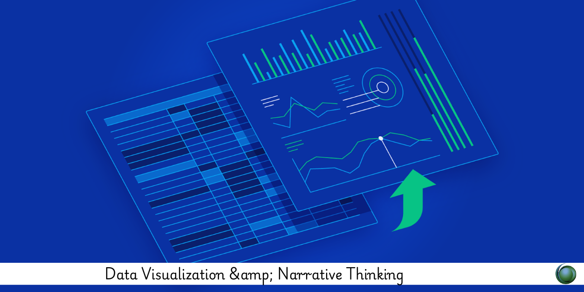
Data is only as powerful as the story it tells. “Data Visualization & Narrative Thinking” bridges the gap between raw analytics and compelling storytelling. This course teaches you how to transform complex datasets into intuitive visuals and integrate them into meaningful narratives that drive understanding and action. By combining visual design with narrative structure, you’ll learn to craft stories that inform, inspire, and influence.
Prerequisites
-
Basic understanding of data analysis (Excel, SQL, or BI tools)
-
Familiarity with data visualization tools (e.g., Tableau, Power BI, Excel, or others)
-
Curiosity about storytelling and communication
-
No coding required, but optional Python/R knowledge is helpful for advanced cases
Table of Contents
1. Introduction to Narrative Thinking in Data
1.1 What is Narrative Thinking?
1.2 From Data Points to Story Arcs
1.3 The Psychology of Understanding Through Stories
1.4 Why Stories Make Data Memorable
2. Foundations of Data Visualization
2.1 Principles of Good Data Design
2.2 Chart Types and When to Use Them
2.3 Data-Ink Ratio and Visual Clarity
2.4 Avoiding Misleading Visuals
3. Structuring Your Data Story
3.1 Identifying the Core Message
3.2 The Setup, Conflict, and Resolution Framework
3.3 Crafting a Visual Flow of Information
3.4 Balancing Detail with Brevity
4. Audience-Centric Design
4.1 Who Are You Speaking To?
4.2 Adjusting Depth Based on Audience Expertise
4.3 Designing for Decision-Makers vs. Analysts
4.4 User Experience in Dashboards and Reports
5. Visual Storytelling in Action
5.1 Real-World Examples of Narrative Dashboards
5.2 Storytelling with Time-Series and Trends
5.3 Creating Persuasive Infographics
5.4 Annotating Visuals for Maximum Impact
6. Tools for Visual-Narrative Integration
6.1 Tableau Story Points and Dashboards
6.2 Power BI Bookmarks and Narratives
6.3 Google Data Studio for Storytelling
6.4 Using Flourish, Infogram, and Canva Creatively
7. Emotional and Cognitive Principles
7.1 Engaging Attention with Visuals
7.2 Framing and Bias in Data Presentation
7.3 Ethical Considerations in Data Storytelling
7.4 Using Color, Contrast, and Layout to Guide Emotion
8. Testing and Feedback Loops
8.1 Gathering Feedback on Clarity and Flow
8.2 Iterating Based on Comprehension Metrics
8.3 A/B Testing for Story Engagement
8.4 Refining Narratives Based on Outcomes
9. Case Studies and Industry Applications
9.1 Financial Forecasts and Investor Briefs
9.2 Marketing Campaign Performance Narratives
9.3 Healthcare Trends Visualization
9.4 Government and Public Policy Reports
Combining data visualization with narrative thinking enables you to move beyond charts—to communication that resonates. By learning to frame insights within a story, you empower your audience to see patterns, feel meaning, and take action. This course equips you with tools, frameworks, and mindset to turn every dataset into a clear, compelling, and ethical narrative. In a data-saturated world, storytelling is your competitive edge.

Reviews
There are no reviews yet.