

Description
Introduction
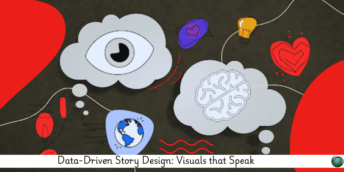
In an era overflowing with data, the ability to design visuals that not only inform but resonate is a critical skill. This course empowers learners to transform raw insights into compelling visual narratives. You’ll master how to strategically use data visuals—charts, infographics, and dashboards—to engage your audience and convey powerful stories that drive decisions.
Prerequisites
-
Basic knowledge of data analysis
-
Familiarity with data visualization tools (Excel, Tableau, Power BI, etc.)
-
Interest in storytelling and visual communication
Table of Contents
1. Foundations of Data Story Design
1.1 Why Data Needs a Narrative
1.2 Principles of Effective Storytelling
1.3 Combining Logic (Data) with Emotion (Design)
1.4 Identifying the Core Message
2. Audience-Centered Design
2.1 Understanding Stakeholder Mindsets
2.2 Data Literacy Levels and Communication Styles
2.3 Context-Aware Visualization
2.4 Designing for Action, Not Just Insight
3. Data Visualization Best Practices
3.1 Choosing the Right Chart for the Right Story
3.2 Layout, Hierarchy, and Design Patterns
3.3 Accessibility and Cognitive Load
3.4 Simplifying Without Losing Meaning
4. Storyboarding with Data
4.1 Structuring the Flow of Insight
4.2 Visual Hooks: Headlines, Annotations, and Highlights
4.3 Creating Emotional Arcs Using Data
4.4 Sequencing Visuals for Impact
5. Visual Tools and Techniques
5.1 Tableau, Power BI, and Google Data Studio
5.2 Infographics with Canva and Adobe Illustrator
5.3 Interactive Stories with Flourish and Datawrapper
5.4 Low-Code Dashboards for Live Narratives
6. Designing for Business Impact
6.1 Storytelling in Dashboards and Reports
6.2 Using Visuals in Pitches and Presentations
6.3 Designing for Executive-Level Decision Making
6.4 Aligning Visuals with KPIs and Goals
7. Emotional Intelligence in Visual Communication
7.1 Using Color, Shape, and Movement with Purpose
7.2 Enhancing Empathy Through Visual Design
7.3 Visual Cues for Urgency, Growth, or Risk
7.4 Building Trust with Transparent Storytelling
8. Feedback, Testing, and Iteration
8.1 A/B Testing Visual Variations
8.2 Gathering Viewer Feedback
8.3 Iterating Based on Business Outcomes
8.4 Maintaining Visual Consistency Across Stories
9. Real-World Case Studies
9.1 Data Storytelling in Marketing Analytics
9.2 Finance Dashboards That Drive Strategy
9.3 Public Health Visuals for Awareness Campaigns
9.4 Government and Civic Data Transparency Projects
Data visuals that truly speak don’t just show—they connect. This course helps you design stories that resonate, persuade, and move people. By merging analytical precision with visual emotion, you’ll learn how to deliver data narratives that are not only seen, but remembered. Whether presenting to clients, teams, or the public, you’ll walk away with the skills to communicate insight with clarity and purpose.


Reviews
There are no reviews yet.