

Description
Introduction
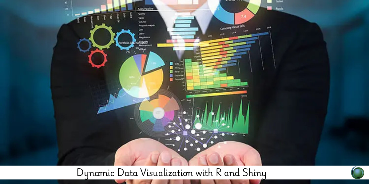
Visualizing data dynamically enables deeper insights by allowing users to interact with and explore datasets in real time. This course, “Dynamic Data Visualization with R and Shiny,” focuses on creating interactive, responsive visualizations using R’s Shiny framework. You’ll learn how to combine powerful R visualization packages with Shiny’s reactive programming to build dashboards and applications that update based on user input. Ideal for data analysts and scientists, this course will help you communicate complex data stories clearly and effectively through engaging visuals.
Prerequisites
-
Intermediate knowledge of R programming
-
Experience with data visualization packages such as
ggplot2 -
Basic understanding of Shiny fundamentals helpful but not required
Table of Contents
1. Introduction to Dynamic Visualization
1.1 Why Dynamic Visuals Matter
1.2 Overview of Shiny and Visualization Packages
1.3 Setting Up Your Development Environment
2. Building Basic Shiny Visualizations
2.1 Creating Reactive Plots with ggplot2
2.2 User Inputs: Sliders, Selectors, and Checkboxes
2.3 Making Plots Reactive to User Controls
2.4 Debugging and Testing Visual Components
3. Enhancing Visualizations with Interactivity
3.1 Using plotly for Interactive Graphics
3.2 Adding Tooltips, Zoom, and Pan Features
3.3 Interactive Tables with the DT Package
3.4 Linking Multiple Visuals Reactively
4. Advanced Visualization Techniques
4.1 Dynamic Faceting and Filtering
4.2 Animations and Time-Series Visualizations
4.3 Custom Visual Themes and Styling
4.4 Integrating Maps and Geospatial Data
5. Data Manipulation for Visualization
5.1 Preparing and Summarizing Data Reactively
5.2 Handling Large Datasets Efficiently
5.3 Caching and Performance Improvements
5.4 Working with Real-Time Data Sources
6. Dashboard Design and Layout
6.1 Organizing Multiple Visual Components
6.2 Responsive Layouts with Flexdashboard and Shiny
6.3 Adding User Guidance and Annotations
6.4 Accessibility and Usability Considerations
7. Deployment and Sharing
7.1 Deploying on shinyapps.io
7.2 Hosting on Shiny Server and Other Platforms
7.3 Exporting Visualizations and Reports
7.4 Version Control and Collaboration Tools
8. Case Studies and Practical Projects
8.1 Sales Performance Dashboard
8.2 Public Health Data Exploration
8.3 Environmental Data Monitoring
8.4 Customer Behavior Analysis
9. Resources and Next Steps
9.1 Recommended Packages and Tools
9.2 Community Support and Tutorials
9.3 Best Practices for Visualization Design
9.4 Continuing Your R and Shiny Journey
By mastering dynamic visualization techniques with R and Shiny, you’ll be able to craft interactive, insightful visual data stories that engage users and empower decision-making. This course prepares you to create polished, data-driven applications that bring your analysis to life.


Reviews
There are no reviews yet.